Talkie Walkie is an illustration agency based in Paris. We represent a selection of international illustrators, collaborating with a wide range of clients in the fields of press, communication and culture.
Talkie Walkie is an illustration agency based in Paris. We represent a selection of international illustrators, collaborating with a wide range of clients in the fields of press, communication and culture.
News
Alexis Tyrsa
Audemars Piguet
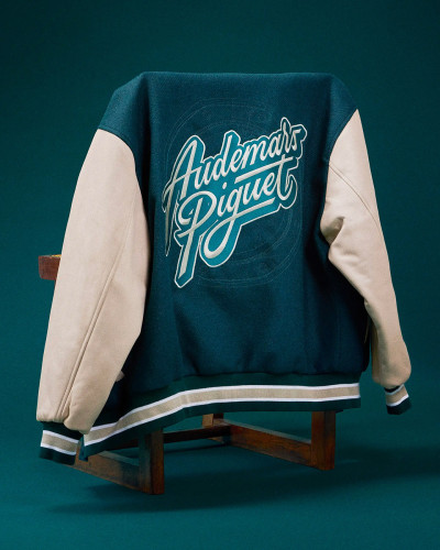
To celebrate a century and a half of history and craftsmanship, Audemars Piguet has called upon Alexis Tyrsa to design a complete collection of textiles and accessories, created for their most loyal clients.
Produced in a limited edition — including some exclusive pieces made in collaboration with exceptional artisans — every item in this collection faithfully embodies the excellence and refinement that define the Maison Audemars Piguet.
Damien Florébert Cuypers
Nouvel Obs / Modorama
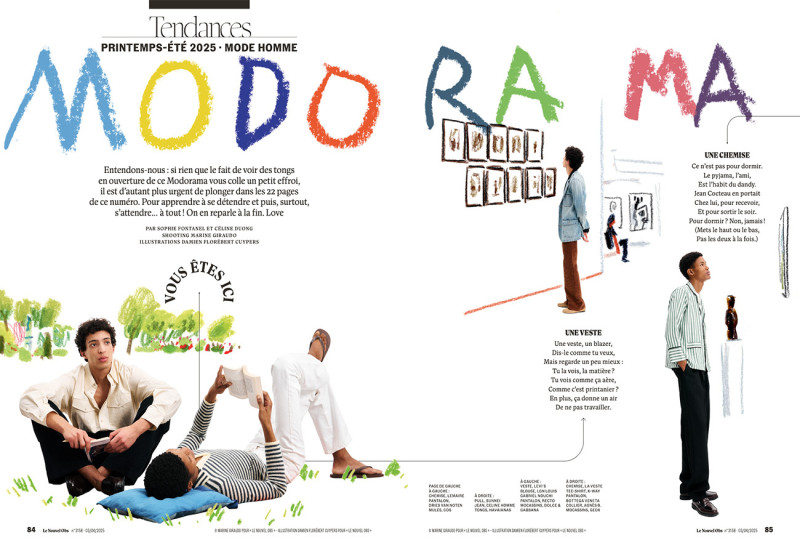
When illustration and fashion become a duo: the result is Modorama Homme for Le Nouvel Obs, created by Sophie Fontanel and Céline Duong, shot by Marine Giraudo, and illustrated by Damien Florébert Cuypers. It's soft, it's subtle, it's colorful—and above all, it's a perfect match. As Sophie Fontanel put it: “Thank you for flooding these pages with poetry.”
Jean-Michel Tixier
Joseph Perrier
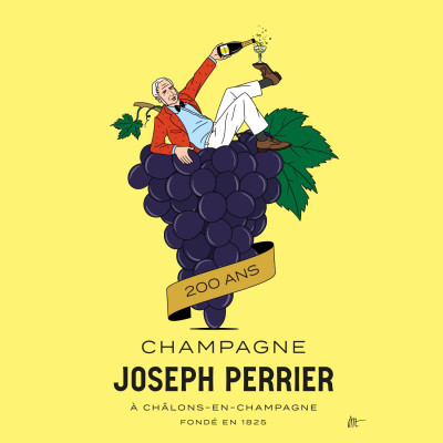
Know-how, tradition and transmission: this is what Jean-Michel Tixier illustrates through a collaboration in honor of the 200th anniversary of the Joseph Perrier Champagne House. He perpetuates the codes of the poster artists of the time, with an entirely manual process, silkscreen printing and a magnificent fresco created on the site. A rich work, in which Joseph Perrier is depicted in a pop and elegant way. A poster that will be handed down from generation to generation, until the next celebration.
Jean Jullien
Exposition Osaka Kaiju
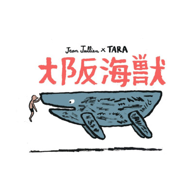
Osaka Kaiju is a monumental work created for the Tara Ocean Foundation and exhibited in the French pavilion at the World Expo 2025 in Osaka.
Part ship, part sea creature, this floating installation invites us to reflect on our relationship with the ocean in the face of environmental challenges.
Illustrated by Jean Jullien, and accompanied by an immersive soundscape composed by Nico Jullien, it draws inspiration from contemporary Japanese culture to tell stories between myth and reality.
The invitation to this poetic installation was hosted by Jeremy Boulard Le Fur and Paul Bourgois.
Debora Szpilman
Kinship
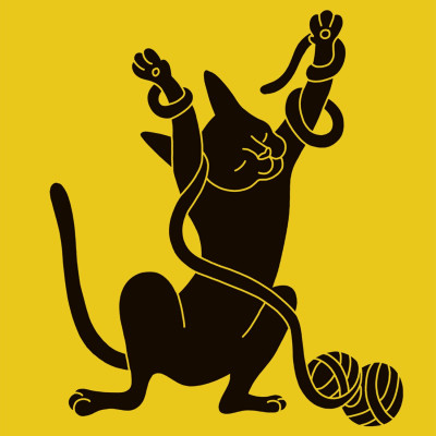
Debora Szpilman has softened the features of the animals we love, but who don't necessarily make our lives easier, for the American app Kinship, a veritable source of expert answers, daily advice and all the information you need about your pet.
Dogs, cats, rabbits, parrots, fur, scratches, droppings, cries, these warm illustrations humorously remind us of these cute, but not so cute, companions.
Jean-Michel Tixier
Café Kitsuné Opéra
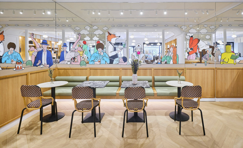
Whether you're at the bar or in the lounge, enjoying a ristretto or a hot chocolate, you can't miss Jean-Michel Tixier's illustrations for the new Café Kitsune in Opéra. With his hand-painted mural by PALM, he has infused the place with a cool vibe, and his very own touch of craziness, to make your coffee breaks as enjoyable as possible.
Stefan Glerum
Society
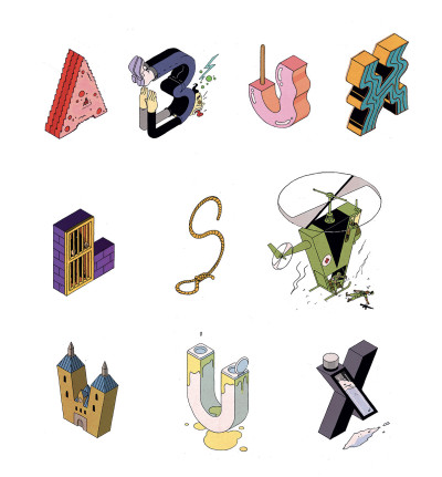
If you don't know what ketamine is, Stefan Glerum made the illustrations of an abcedary for a Society article about this product. With great finesse, Stefan enlightens us on this subject as the alphabet progresses, without anesthetising us.
Gwendal Le Bec
Le prolongement
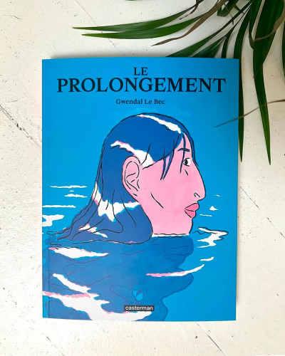
Life is what separates the beginning from the end. In his first adult comic, entitled "Le Prolongement", published by Casterman, Gendal Le Bec deals with this complex subject that sometimes questions us: the meaning of life. Through a couple of retired, Gwendal talks about aging and its consequences on love and desire. With great sincerity, tenderness and humor, he addresses the intimate and how the human being confronts the reality of existence.

Jean André
Adidas x Jean André
For the Original Tour, organized by Adidas,Jean André made a serie of illustrations celebrating the 3 stripes brand and Paris. Present for two days at the flagship of the Champs-Élysées, his unique creations were proposed to the public in form of flash tattoos and embroidery on the famous Firebird jackets.
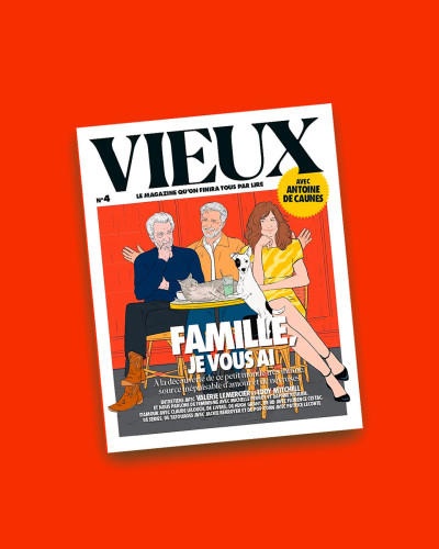
Vieux le Mag
It's already the fourth issue of Vieux Magazine we've participated to, by illustrating many articles. With the release of it's latest issue, dedicated to the Family, we can say that we're celebrating our wax wedding anniversary, and that the bond that unites us gets stronger every month. During these different editions, many artists participated such as Yann Le Bec, Gwendal Le Bec, Playground Paris, Quentin Schwab, Jean-Michel Tixier or Damien Cuypers, illustrating a whole bunch of diverse and varied articles. Long life to Vieux Magazine!
Special mentions: for Sylvie Faur, who illustrated the covers, for the art direction of Sylvestre Hovart, and for the trust of Romain Jubert and Antoine De Caunes.

Debora Szpilman
New York Times
In an article of the New York Times, Debora Szpilman illustrates how Donald Trump is gradually undoing the American state with successive decrees, to make it an empty shell of democracy.

Antoine Corbineau
Planet Coaster
With Antoine Corbineau, fun looks like a long quiet slide. For the last campaign of the video gamePlanet Coaster 2, he proposed a large format as only he knows how to do. Just enough to make us dive head first into the joysticks.

Jérémy Schneider
Eastern Oriental Express
For those who would travel with theEastern Oriental Express, be sure that your ticket is worth gold, especially thanks to Jérémy's illustrations from the Violaine&Jeremy studio. Jérémy drew his inspiration from the pure Malaysian tradition, with detailed patterns, warm colors, which can be found in the landscapes that the train crosses. With as much delicacy as ever, his creations are the witness of the experience that the passenger will live by taking this legendary train.

Damien Florébert Cuypers
Hôtels Amour
If you are staying in the Paris Amour Hotel or the one in Nice, you will surely fall in love with the work of Damien Cuypers. For this collaboration, he illustrates the whole atmosphere of these places of passage, the ambience that reigns there and those who can be met there. A beautiful tribute that makes us want to book a room for the entire year.

Yann Le Bec
Welcome !
We are delighted to announce the arrival of Yann Le Bec at Talkie Walkie. It is with great joy that we welcome him to the agency. Painter, illustrator and comic book author, Yann takes through his raw portraits, his landscapes and still lifes all in nuances, a sensitive and vibrant look at our world. Yann joins his brother Gwendal, who we have been representing for a few months. Long live family and welcome Yann!

Jean André
Dorcel x Jean André
There's no harm in having a little fun. Well, for this Valentine's Day, Jean André confirms us that's true. For Dorcel, he made a beautiful box set, "LOVE ME MORE", dedicated to love, with illustrations celebrating uninhibited sensuality, for the benefit of the erotic well-being.

Playground
50 States of America / Les Arènes
After Donald Trump's swearing-in ceremony of January 20, rediscover the United States with the release of the book 50 States of America published by Les Arènes. Paper version of Quotidien's podcast, named the same way, each page is a painting, especially thanks to the illustrations of Playground Paris. Whether it's history, politics, unknown facts or gastronomy, we travel through this country in an original and fun way. To have absolutely in his home library.

Laurent Duvoux
Le bruit du monde
One of the first contacts we have with a book is usually through the jacket that is offered to us. In collaboration with the French editions from Marseille Le bruit du monde, Laurent Duvoux made the three covers of the novels by Philippe Manevy, Christian Astolfi et Akos Verbozy. With a lot of authenticity and in a delicate style, he was able to capture on the outside what is hidden in the inside and invites us to dive into the stories proposed by those authors.

Jean André
Tuxedo
Happy New Year!
To celebrate 2025, we start the year by sharing this illustration by Jean Andre for the latest album of the group Tuxedo.
Cheers!

Jean Jullien
Kobe public transport
If you are currently in Kobe, you may see Jean Jullien's illustrations on a bus. In an enthusiastic and positive campaign, he encourages us to use public transport in our daily journeys, in order to preserve our common good.