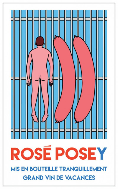
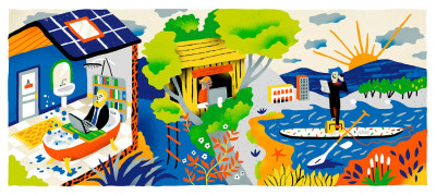
Rosé Posey is a new wine dreamt up by three friends who all love good wine, the summer and the sun. Following their first collection in 2019, they have once more joined forces with Jean-Michel Tixier for a new series of labels featuring illustrations that have lost nothing of their burlesque and defiantly summery character!

Jean André
Orangina / Trends Paris
Just for this summer, Orangina is shaking up the letters of its name and bringing out a range of products branded Onagrina! To mark the launch of this new range, inspired by the brand’s slogan “Shake it!”, Jean André has come up with a series of fun and quirky anagrams to adorn different goodies to be sent to influencers and journalists.

Cruschiform
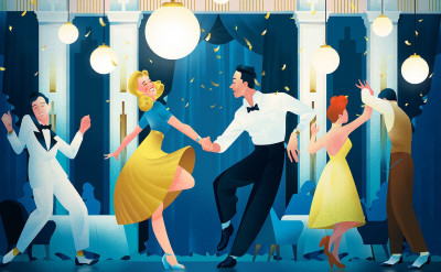
Longines Tuxedo / H5
H5 turned to Cruschiform to give their campaign a party feeling with an illustration celebrating the iconic Tuxedo model from watch brand Longines. With her delicate universe and her sensitivity to color, she expresses the sophisticated elegance of the 40s through a snapshot full of life, paying homage to the brand’s creative heritage. Discover the animation here.

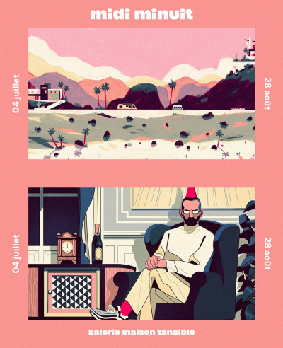
Bruno Mangyoku
Midi Minuit / Maison Tangible
Bruno Mangyoku and Kim Roselier are taking part in the Midi Minuit (Midday Midnight) exhibition organized by Maison Tangible to mark the company’s first anniversary. “A total of 11 artists will lead you on a fantastical journey between day and night, telling you a tale that takes you between images fixed in time and extended narration on screen.” This augmented-reality exhibition is shaping up to be an amazing experience. Runs from July 4 to August 28 at 3 bis Rue Jules Vallès, in the 11tharrondissement of Paris.

Antoine Corbineau
EDF / Ici Barbès
Antoine Corbineau has created two illustrations for the latest edition of Vivre EDF, the internal magazine of French energy company EDF, looking at how working conditions are changing amid lockdown. With his distinctive compositions of brightly-coloured landscapes teeming with life, Antoine brings a light-hearted approach to the thorny issues surrounding working from home.
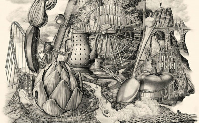
Jérémy Schneider has teamed up once more with French chef Jean Imbert, this time along with Pharrell Williams, for the opening of their new St. Tropez restaurant, To Share. Jérémy has created a gargantuan visual identity, based around an illustration of an imaginary funfair full of outsized fruits and vegetables. In his usual style, Jérémy signs off here on a rich and sophisticated identity, which can also be shown as an animation accompanied by music composed especially for the occasion by Pharrell Williams.

Playground
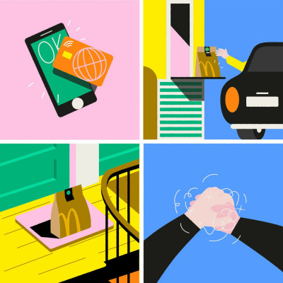
McDonald's / TBWA Paris
TBWA turned to Playground to create a series of illustrations for McDonald’s, setting out the distancing measures being put in place for the reopening of the chain’s restaurants. These modern and educational pictograms are brought to life with Playground’s signature range of bright, joyful colors!

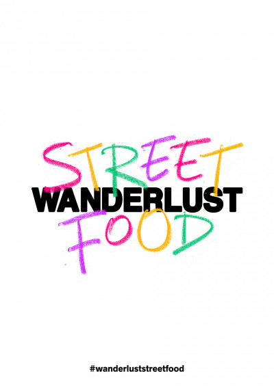
Alexis Tyrsa
Wanderlust Street Food
Tyrsa created a new identity for Wanderlust Streetfood, a pop-up restaurant that will take its place on the Wanderlust terrace this summer. Chef Alexia Duchene will be serving up a menu full of streetfood classics, made from ingredients sourced from small-scale producers. Driven by his constant search for new tools and new mediums, Alexis Tyrsa created a logo and a signage using colored chalk, allowing him to come up with this box-fresh identity, full of innocence and color, inviting us to get back onto the terraces! Mandatory reservation and further info on the Wanderlust site.

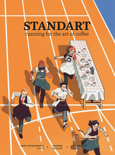
Bruno Mangyoku
Standart Magazine
Created in 2015, Standart is a magazine featuring interviews, articles, city guides and short stories – all themed around the art of coffee. Each edition features talented artists, writers and contributors from around the world. Among these creators is Bruno Mangyoku, who had the pleasure of illustrating the magazine’s most recent edition, themed around the Olympic Games.

Julien Pacaud
Nouvelle série
A new illustration series by Julien Pacaud for Liberation, Politicomag or taken from his personal collection.
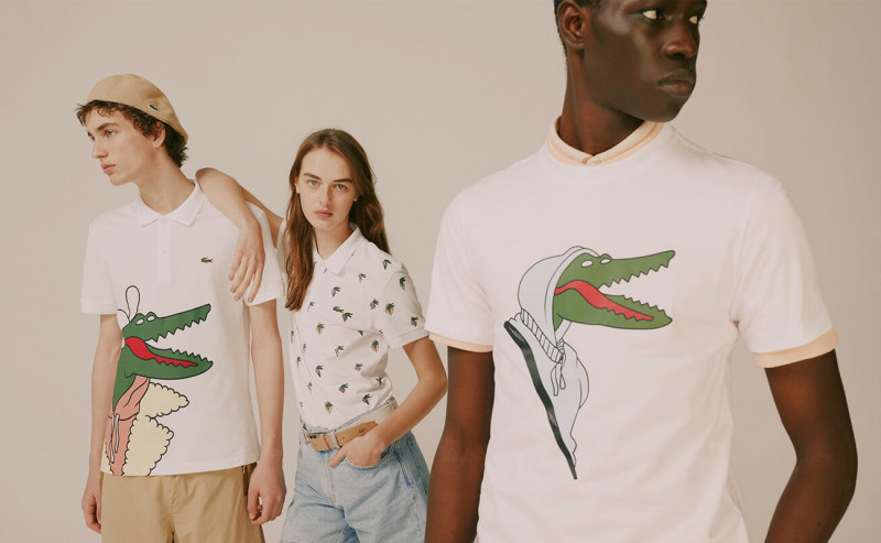
This season, Lacoste gave Jean Michel Tixier carte blanche to reimagine their emblem, the famous little crocodile. He conjured up an array of anthropomorphic crocs, each with its own look - a stylish hipster, for example, or an old-school Parisian dandy from St Germain des Près. Jean-Michel Tixier’s quirky and comical Parisian crocs have appeared full-size in ad posters, and also as logos on polo shirts, sweaters and totebags in the #crocoseries collection. Check out this limited edition series in Lacoste stores or on their site.

The French mail service (La Poste) and newspaper Le Figaro turned to Playground to create the graphic identity for their joint new show “Postalk” on website Figaro.fr. The result is a series of illustrations in a minimalist style exploring themes such as sustainable development, the digital world and proximity, as well as discussions about the mail of tomorrow.

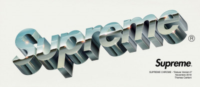
Thomas Cantoni is a huge fan of the chrome and aesthetics of the era of stickers, caps and skateboards, the classic Made in the USA era. He was therefore the natural choice for brand Supreme to turn to, asking him to give a fresh look to their logo as they release a collection of products including T-shirts, sweatshirts and skateboards with a truly vintage look!
Jules Le Barazer
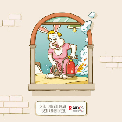
Aides / TBWA Paris
Non-profit group Aides has launched a new prevention campaign against the risk of HIV in the time of Covid-19. The campaign, illustrated by Jules Le Barazer for TBWA Paris, is a raucous and funny call for awareness, under the hashtag #deconfinementducul (sex unconfined). “We can’t wait to see each other again – let’s remember to protect each other.”

Jean-Michel Tixier
M, le magazine du Monde
Jean-Michel Tixier continues his response to the new trends of the post-confinement world in this special style series for the Le Monde magazine, M.

We dug into our archives to unearth this stunning retro-futurist illustration by Stefan Glerum. This excursion into space, silkscreen-printed by hand in nine colors, was created by the artist for publishers Black Dragon Press. Still available here.
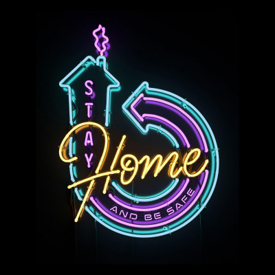
Alexis Tyrsa linked with his friend and 3D artist Rizon Parein to create this dazzling ‘stay home and be safe’ image. The duo played on the aesthetic codes of neon signage, traditionally associated with nightlife spots, to urge people to stay home during confinement.

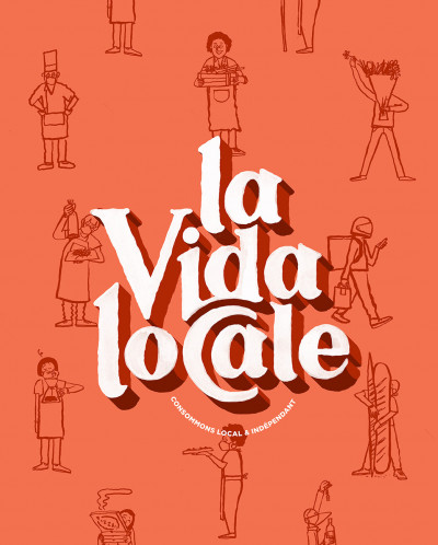
Alexis Tyrsa
La vida locale
First thought of by Julien Pham, and translated into images by Alexis Tyrsa and Jean Jullien, the hashtag #lavidalocale came about in response to the difficulties currently being faced by the hospitality industry. Through this hashtag, users can share their favourite local spots on social media, helping to promote buying locally, and boosting independent businesses.

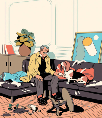
Bruno Mangyoku has created this graceful series for magazine Smartread. He lends a touch of humor to an article on ‘emotional resilience’, or how growing old can sometimes make us more able to adopt an optimistic approach to tackling adversity, no matter what the circumstances.
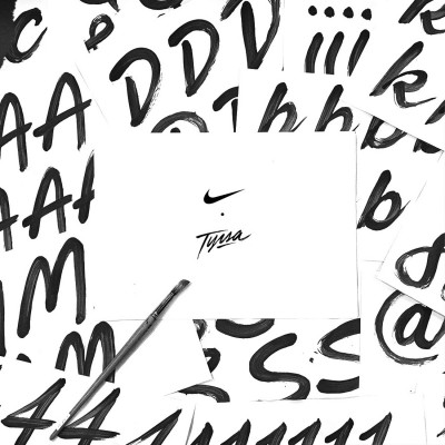
Alexis Tyrsa had the pleasure of creating an entire new font for the identity of Nike Golf. The characters were all painted in acrylic, then scanned, vectorized and published through a font file. In order to introduce a maximum of liveliness to this hand-drawn typography, two options are available for each character, making a huge range of letter-combinations possible.